css howto
shrink flex item to the remaining space
In many places, I need to adjust the dimension of one container to its father container, rather than the opposite, which is easier.
We know, as the most fundamental flex knowledge tells us, if there is some remaining space for its children, then the child can grow its size to fill these remaining space when we set their flex-grow property to 1 or a number else.
However, if the content of one child exceeds its father's space limitation, then the default flex-shrink property would not work as much effective as what the flex-grow does.
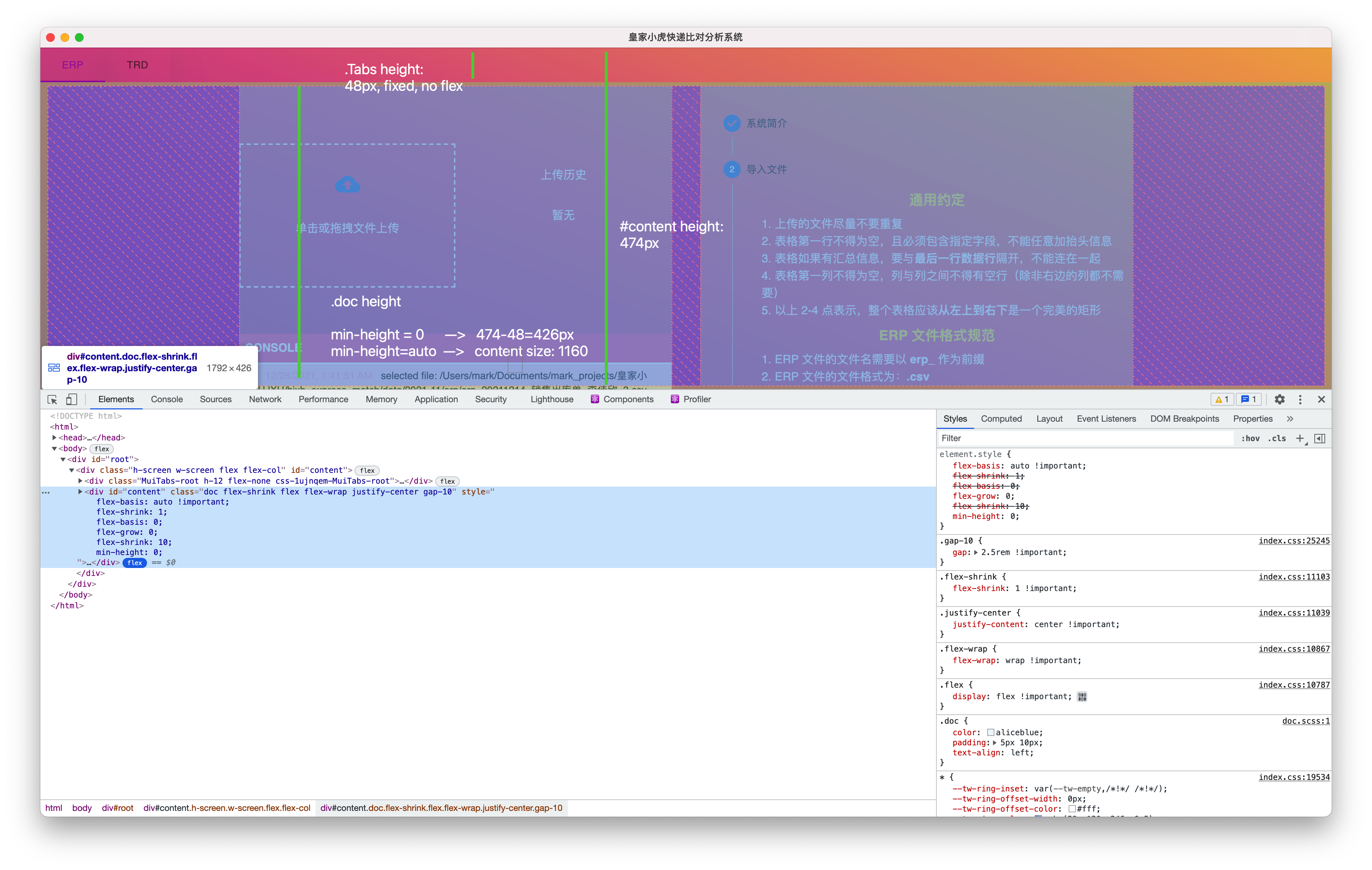
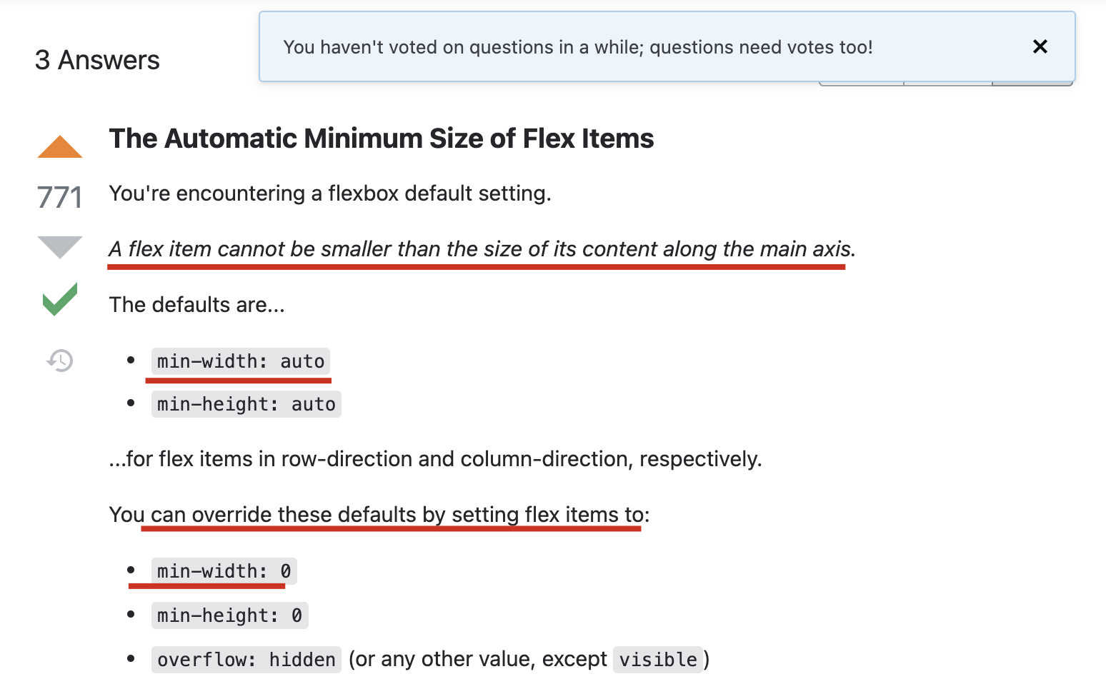
The reason behind this would owe to the mechanism that the default min-width/height is set as auto, that means the size of child can't shrink to less than the size of its content, i.e. min-content.
Whereas, if only we change the min-width/height to 0, then we can breakthrough this limitation, so that the child can shrink to what the real remaining space constraints on it, like this:

Much thanks to: 
And after knowing this remedy, we can answer another problem based on this technique, refer to: set height to equal to its sibling
ref:
Controlling Ratios of Flex Items Along the Main Axis - CSS: Cascading Style Sheets | MDN
html - Why don't flex items shrink past content size? - Stack Overflow
set height to equal to its sibling
There may be many techniques to solve this problem.
And if you try to search on the stackoverflow, you will get at least methods.
use table
The first one is that you can use a table, which is handy to set the dimension of one element to its sibling.
However, I didn't research it so much since using table element would cause misunderstanding to user and later review, which at the same time is definitely not graceful.
use absolute position
The second one is to use a relative position on father, and use an absolute position on which the one element you wanner to dynamically control, supposing its name is B.
In this way, the father's dimension is decided by the content of A, the sibling of B.
Then, since B is absolute, so that won't affect its father. And we can continue to set B's height or max-height equals to its father, adding with overflow: auto.
The biggest disadvantage of this solution is that it's dependent on the position layout, which conflicts with the modern flex solution.
use flex-shrink with min-w/h: 0
The third method I came up with based on flex, is to set B's properties as the following:
cppss flex-shrink: 1; min-height: 0;
If the `flex-shrink` sets to be 0, it means to disable shrink; and otherwise.

However, in the flex ecosystem, the default `min-height` is `auto`, which means we can't decrease/shrink one's size downward to its down limitation.

That's where `min-hight: 0` does its work. More refer to: [shrink flex item to the remaining space](#shrink-flex-item-to-the-remaining-space) .

## text-intent settings

### only first line indent (like chinese  paragraph)

cppss
text-intent: 2em;
start indent from second line (hanging indent)
cppss text-indent: -2em; margin-left: 2em;
### conclusion

As a paragraph (i.e. `p` element), the `text-indent` controls the indent to the content of this element, which equals the indent of first line.

And if we want to realize the effect of 'a hanging indent', which equals that the indent of first line is negative, and thus to remedy the overflow of first line, we force the entire paragraph move a step to the right. That's where `margin-left` does its work.

ref:

- [html - Indent starting from the second line of a paragraph with CSS - Stack Overflow](https://stackoverflow.com/questions/17158253/indent-starting-from-the-second-line-of-a-paragraph-with-css)